
 |
| Lisa Kijak, Odyssey Liquor, Long Beach, 59" x 39" |

The Wayne Art Center is a gorgeous space with soaring white
walls, wood floors and warm wood accents. It is spacious and beautifully lit. The
exhibit was held in two of the galleries in the art center and the space comfortably
housed a well attended opening.

Exhibit
The venue can accommodate very large pieces, which is
refreshing. Elizabeth Brandt’s Selected Stories and Dinah Sargeant’s Spirit
Dogs Greet the Ghosts were amazingly grand and impressive.
 |
| Elizabeth Brandt, Selected Stories, 88” x 89”, flanked by artwork from Niraja C. Lorenz and Lisa Kijak |
 |
| Dinah Sargeant, Spirit Dogs Greet the Ghosts, 58” x 128” |
The downside of including such large pieces, however, is
that they take up so much wall space. I have come to expect more visual space around
individual works in a gallery setting, so the show felt tightly packed,
particularly in the smaller gallery. There were several instances where artwork
was salon hung, one on top of the other, which I didn’t love. I think the show
would have benefited from further editing to give it more room to breathe.
 |
|
An example of salon hanging. Artwork from Marti
Plager, Desiree Habicht, Sara Drower, and Susan Callahan |
As expected, my favorite pieces from the show had
interesting surface details that drew me in. There were so many richly textured
pieces that caught my eye and I found myself returning to them again and again.
 |
| Shin-hee Chin, In-Between: In Search of Identity, 50” x 60” |
 |
| detail image, Shin-hee Chin, In-Between: In Search of Identity |
Shin-hee Chin’s In-Between: In Search of Identity is
beautifully constructed. Her work is so consistently captivating and show stopping.
It is no surprise that she was granted an award for her piece.
 |
| Marianne Burr, Eleven 3 Eleven, 43” x 32” |
 |
| detail image, Marianne Burr, Eleven 3 Eleven |
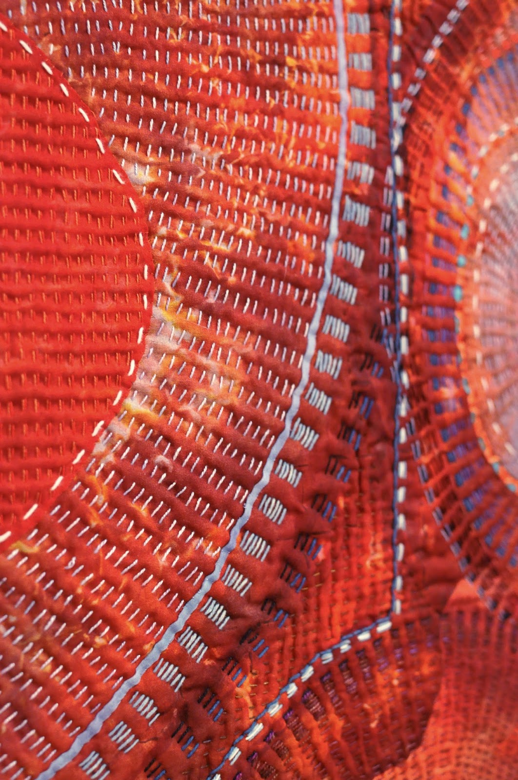
I’m always impressed with the hand stitching in Marianne Burr’s
work. The colors in this piece vibrated and I loved the movement she created
with her line work. This piece honors the lives of those impacted by the 9.0
earthquake off the coast of Japan and devastation at Fukushima in 2011.
 |
| Naomi S. Adams, Kindred, 36” x 42” x 3” |
 |
| detail image, Naomi S. Adams, Kindred |
Kindred by Naomi S. Adams crosses into sculpture as it stands 3” off of the wall in interesting
folds and forms. I very much enjoyed examining this one up close. The shape of
the work and my experience changed vastly depending on the viewing angle.
 |
| Brigitte Kopp, Too Tired To…, 58” x 49” |
 |
| detail image, Brigitte Kopp, Too Tired To… |
I first discovered Brigitte Kopp’s work at Quilt National
13. This piece, Too Tired To…, has such
interesting details. From the red embroidered figures to the intriguing use of
latex, there was so much to engage with visually.

Catalog
The artists received a complimentary catalog, which is a lovely touch. As a former graphic designer, I look at every detail of the catalog layout. There was a lot that I loved about the catalog. My favorite part was how thoughtfully works were chosen for spreads. Whether based on complimenting colors or formats, time was clearly spent choosing works that looked great together. With 66 pieces in the show, that was a pretty significant task.
The quality of the photographs is excellent. The photographs
are all artist submitted images, so it really shows how important quality
images are for jurying. There were very few pieces that didn’t match the
artwork precisely. The pictures are crisp and clear. I wish there were detail
images, but the smaller format doesn’t really leave room for them.
The artist statement for each piece is included in the
catalog. Personally, I like being able to read about inspiration behind an artwork.
I know that art is supposed to speak for itself, but I like being able to gain
insight into how a piece fits into a larger body of work.
One of the things that I didn’t love was the inconsistency
with placement of the text. The artist statements, titles, techniques and
materials bounce all over the page. Part of this is due to the size and the format
of the book and the desire to show the largest images of the art as possible,
which I appreciate. But personally, I like it to be uniform and consistent from
page to page. Thumbing through the catalog quickly felt a little dizzying.
It is hard to get a sense of the scale of the works from a
printed catalog or photographs. You miss the texture and dimension of the
fabric and stitch. However, I would still strongly recommend purchasing the catalog. It documents the show very well and I am so very pleased to add it to
my bookshelf.
Overall, I am thrilled to be a part of such a strong
exhibition. If you are in the area, please make sure to stop in and see it
before it closes. I promise, you won’t regret it.
No comments:
Post a Comment